Louis Vuitton & Sofia Coppola: rosa + neón + corazones
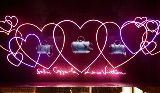
Para celebrar el lanzamiento de la SC Bag en la tienda departamental Le Bon Marché en Paris, Louis Vuitton colaboró con Sofia Coppola. Juntos diseñaron 10 vitrinas que sirven como escenario para esta esperada bolsa.
Cada uno de los escaparates refleja la personalidad de Sofia y utiliza elementos que ha declarado cercanos a ella.
We just talked about things I liked in this mood: I Love neon and hearts, and I have a photo of a baby deer that I love. I wanted the windows to feel personal, connected to me and that women would enjoy. – Sofia Coppola
Lo que más sobresale en el diseño son los corazones, el color rosa y el uso del neón. En especial a mi me a gustado la del venado que esta en medio de las flores gigantes… ¿Cuál les gustó a ustedes?


 [Le Bon Marché, Paris. Fuente: WGSN]
Hackett, febrero loco y marzo otro poco
Por ahí dicen que febrero loco y marzo otro poco. En Hackett entienden a la perfección lo impredecible del clima de estos días y lo reflejan en sus vitrinas.

 [Hackett. Antara Polanco. México DF]
—-
Hackett, February is crazy and March an other bit
We have a saying in México that states: “February is crazy and March an other bit” which means that although spring has arrived the weather is unpredictable with hot day, cold nights and winds can blow us away. Hackett clearly understood the city weather and successfully reflected it on its windows.
Julio, detalles de San Valentín
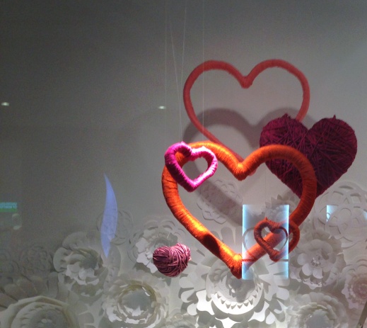
Pocos fueron los escaparates de San Valentín que me parecieron lindos. Sin duda alguna, el que más me gustó fue el de Julio. Es cierto que sólo es un detalle, pero no se necesitaba más para recordar la fecha sin llegar a ser cursi. Además fue bastante atinado que los corazones contrastarán con la campaña principal (de la cual ya les había contado). Los corazones estaban forrados con estambre, eso además de color le agregaba textura.
¿Les gustó? ¿Hay alguna otra que les haya parecido interesante?
 [Julio. Santa Fe. México DF]
—-
Julio, a little something for Valentine’s day
There were few interesting window this Valentine’s day. Without doubt, the one I liked more was from Julio. It is true that it was only a detail, but it was all that the it needed to celebrate the date without being cheesy. Also it was remarkable the contrast of color and texture of the elements with the main campaign. The hearts were wrapped with yarn, that added both texture and color.
¿Did you liked it? ¿Is there any other Valentine’s day display that you found interesting?
Uterqüe, primavera acuática

La marca Uterqüe apuesta por una primavera acuática. En sus vitrinas florecen nenúnfares blancos (tuve que buscar como se llaman estas flores… esa palabra esta muy fuera de mi vocabulario habitual) sobre fondo verde.
Esta marca pertenece al grupo Inditex y el nombre significa «Ambos» y «El uno y el otro». Hasta cierto punto el escaparate va con el nombre. Si lo piensan este retrata dos mundos: las flores reflejan la parte acuática, mientras el pasto da pie a lo terrestre.
Me gustó que del centro de las flores salga una repisa para exhibir bolsos y zapatos. Da la sensación de que éstas están floreciendo. ¿Qué les parece?

 [Antara Polanco. Uterqüe]
—-
Uterqüe’s acuatic spring
This season Uterqüe shows us a acuatic spring. It showcases water lilies (I had to google these flowers … gardening is way out of my expertise) over a green background.
The brand belongs to Inditex and its name means «both» and «one and the other». To some extent the window concept goes with the name. If you think about it, it portrays two worlds: the flowers reflect the water, while the grass leads to the terrestrial.
I liked that from the center of the flower emerges a shelf useful to display bags and shoes. It seems that they are flourishing. Do you agree?
Flores blancas en Julio

Julio es una marca que le ha apostado al diseño en sus escaparates. Ejemplo de ello es esta colaboración con amoATO para el diseño de la campaña de primavera/verano 2013. Todo el fondo esta hecho de varios suajes de papel que puestos unos sobre otros forman una ola de flores blancas.
En general el concepto me gusto. Me encanta que toda la vitrina sea de color blanco. De esta manera los colores de la ropa resaltan de forma instantánea. Sin embargo, los props no me terminan de convencer. Sobretodo los barrilitos. Éstos parecen una solución forzada a la pregunta: ¿Dónde colocamos los bolsos?

 [Julio. Santa Fe. México DF]
—-
Julio’s white flowers
Julio is a brand that has favour design in many aspects including its window displays. An example is the recent collaboration with the design studio amoATO for the design of the spring / summer 2013 visual merchandising. The background is made of several cuts of paper layered to create a wave of white flowers.
Overall I like the concept. I love how the whole window is white. It highlights the color of the clothes instantaneously. However, the props not convince me at all. Specially the barrels. These look like a forced solution to the question: Where do we put the bags?
Ophelia
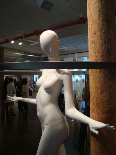
Ya tenía un ratito que no escribía nada… no están ustedes para saberlo ni yo para contarlo pero desde que regresé de la maestría ando de arriba para abajo y con un sin fin de cambios que poco a poco les iré contado. Pero bueno… vayamos al punto.
En diciembre (si ya sé que eso fue hace 2 meses!!) tuve la oportunidad de ir a la Retail Design Collective en NYC. La verdad fue una experiencia increíble por todo lo que hay que ver, aprender y percibir en una ciudad tan multifacética y dinámica como lo es la ciudad de Nueva York. Afortunadamente tome muchas fotos que les iré compartiendo poco a poco.
Uno de los showrooms que más llamó mi atención fue el de Alu. Esta marca tiene diseños espectaculares, bien resueltos y de mucha calidad. Sin embargo, lo que más me impacto ahí fueron los maniquíes Ophelia de ABC Manichini. Cuyo molde es una mujer (adivinaron bien) de nombre Ophelia.
El maniquí es muy elegante y puede personalizarse. De hecho, dentro del showroom había maquillistas, peinadores y escultores haciendo variaciones del maniquí. Hacer maniquíes es todo un arte. Tal vez en mi próxima vida me dedique a eso!!


 —- Leer más…
Shopping Attitude en Galeries Saint-François
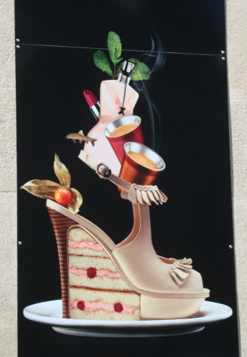
Esta ilustración forma parte de la campaña del Galeries Saint-François para incentivar a las personas a visitar el interior del mall. De manera fenomenal resume todo lo que se va hacer a un centro comercial. ¿Les gusta?
 [Galeries Saint-François. Lausanne, Suiza.]
—-
This illustration is part of the campaign that Galeries Saint-François has to encourage people to visit the interior of the mall. In a amazing form it sums everything you can do at the mall. In other words: shopping attitude mode on. Do you like it?
Los Posts + Vistos


los Comentarios